Three Ways To Increase The Conversion Rate Of Your Website
When a client says that they want to generate more leads, sales, revenue from their website, the most common tactic is to focus on increasing traffic, whether that is through increasing the PPC and/or social media budgets or adding more content in order to attract more organic search traffic.
One option that is often overlooked is increasing the conversion rate. For example:
- 1,000 visitors with a 2% conversion rate = 20 sales
- 1,000 visitors with a 3% conversion rate = 30 sales
That is a 50% uplift in results!
How do you achieve that? Here are three ways you can increase the conversion rate of your website.
1. A/B Test
A/B or split testing allows you to test two alternative versions of your page (page A and page B) so see which one has the highest conversion rate.
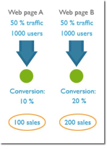
There are a lot of different things you can test on a page, but these are the three that I start with:
- The headline. You should have a strong, convincing and believable headline that promotes the main offer. The legendary ad guru David Ogilvy once said: “On the average, five times as many people read the headline as read the body copy. It follows that, if you don’t sell the product in your headline, you have wasted 80% of your money.“
- The offer. What is it that the customer is getting for their money (how is it all described and laid out).
- The size of your order buttons and the wording of call to action (e.g. “Join now and get access to XYZ” vs “Sign up”). For software products the primary call-to-action should often be the “demo/trial”, not the “checkout/purchase” buttons. Enlarging your action buttons usually helps.
2. Optimize Your Form
ImageScape reduced the number of form fields from 11 to 4 and saw a 160% increase in the number of forms submitted and their conversion rate increased 120%.
Here are three ways you can improve the conversion rate of your form:
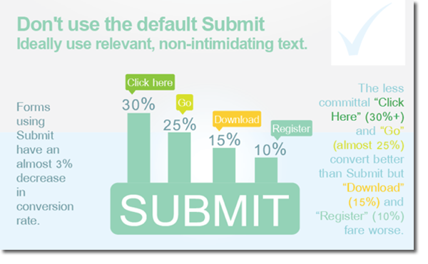
Test the button copy:
One of the easiest changes to make on a form. Instead of using the generic “Submit” text, tests have shown a higher conversion rate using “Click Here” and “Go”.
Form length really does matter:
Expedia has done a lot of testing on what is the idea length of form, and they found that by eliminating company name from a form they were able to increase profits by $12m.
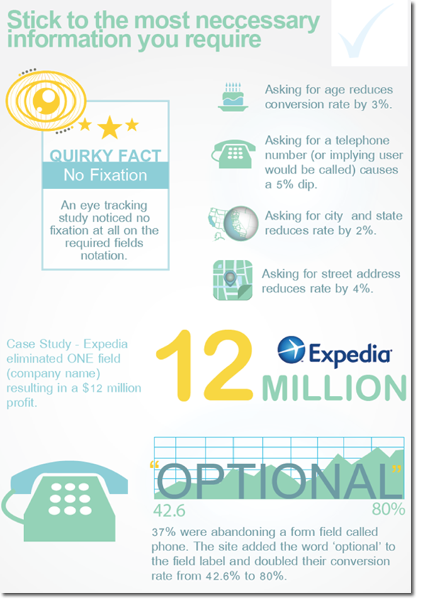
Require Unnecessary Information
Testing has shown that reducing the length of a form from 11 fields to 4, can increase conversion rates by as much as 120%.
What changes can you make to your form?
3. Focus On Google Analytics
One of the most overlooked tools that can be used to improve conversion rate optimization is Google Analytics.
- What are the most common paths that people are taking on your sight?
- Where are they getting stuck or dropping off?
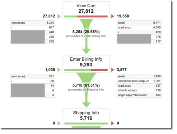
In the Conversions section of Analytics you can review your conversion funnels. By looking at the Funnel Visualization below, we’re able to see how many users dropped off from each step, indicating areas of optimization.
As we can see, it breaks down that we have a significant number of people dropping off after they reach the cart page. Maybe there’s an area for optimization to reduce that drop-off amount.
Recent Posts
Paid Social Media ROAS
Why Your Paid Social Media Ads Aren’t Delivering ROAS—And How to Fix It You’ve invested in paid social media advertising. You’ve committed budget, time, and

B2B lead generation channels
Top B2B Lead Generation Channels in 2025 | Data-Backed Guide to Higher ROI Back in 2018 a single survey claimed that “Search beats every other

Search Visibility
How to Improve Search Visibility and Drive More Organic Traffic For many businesses, low search visibility is a persistent challenge that directly impacts their ability

Creating Killer Buyer Personas
Creating Killer Buyer Personas: The Strategic Imperative for Smart Marketing In today’s digital-first economy, understanding your customer is no longer a luxury—it’s a strategic necessity.

Generative Engine Optimization (GEO)
Generative Engine Optimization (GEO): The Future of Search and How It Differs from SEO As digital marketing continues to evolve, search is undergoing a radical

Best Practices for Building a Brand Presence on YouTube
Updated Best Practices for Building a Brand Presence on YouTube (2025) YouTube continues to be a dominant platform for video content, offering businesses unparalleled opportunities